SwiftUI is convenient, but slow
I've been sitting on publishing these notes for a while, because I don't want to diminish the work of the talented people that engineered SwiftUI and plowed through years of AppKit and UIKit code to get to this state.
But I'd like to draw attention to some performance limitations, in the hope that a SwiftUI engineer might see this and understand pain points that might not be so obvious from their side.
Grila
I built a calendar app for macOS. There are many calendar apps out there, but this one is mine, and I wanted it to fit two very specific use cases:
- keyboard-oriented UI and navigation
- always one key-press away
This is the How?, an idea of the behaviour that the calendar should have when it's done - but the Why? is a bit of a longer story.
In October 2022, my little brother started college, and moving from the countryside to a big city meant large costs of living that my parents weren't prepared for. I wanted to support him somehow.
To support himself, he currently has to work 12 hours a day, 5 days a week (including weekends) at a coffee shop. He barely sees the college building.
I thought I could build a low effort, low maintenance, affordable but still useful app, from which all the proceeds will go towards funding his costs. I actually tried that in the summer but the App Store rejections rendered my efforts useless.
So sifting through my noted app ideas, I thought a keyboard-driven macOS calendar would be the simplest to build, especially with the newest SwiftUI additions.
After all it's just a grid of numbers that doesn't even need to be clickable, how hard could it be? (I'm saying that a lot, aren't I?..)
# The SwiftUI convenience
After a week of long days stretching into the night, I had this thing working that I called Grila (Romanian word for "grid")
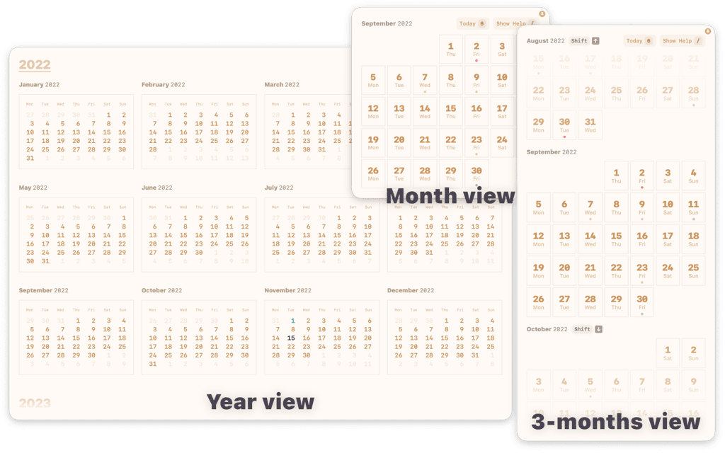
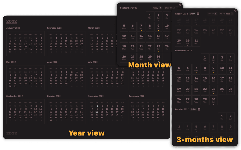
In 7 days I had 3 different views (year, month and 3-months), light and dark mode support, customisable color schemes, keyboard navigation and help hints to make it discoverable, and best of all: ✨ ANIMATIONS! ✨
These damn animations man.. they're so fluid and springy and easy to use in SwiftUI, that it lures you into adding them everywhere.
# The grid
I started with the only obvious grid element for laying out the weeks as rows of days: LazyHGrid
LazyHGrid(rows: (1...7).map { _ in GridItem(.fixed(30)) }) {
    ForEach(days) { day in
        DayView(day: day)
    }
}
And it was obviously wrong for my use case...
This container is lazy so it takes more time get the view rendered because SwiftUI has to check if each row is visible before rendering it.
Since there was no other grid element, I had to write my own using HStacks inside VStacks. This took longer than I expected because I had to compute how many weeks a month has and on what column it starts and ends. As usual, fixing an edge case brings with it three more.
But after this hiccup, almost everything that followed felt surprisingly easy to build.
# The (over)views
For example I wanted to be able to switch between a full year view and month views, which also meant the window had to be resized to fit each view. As soon as I had my separate views, this was all I had to do in my main view:
enum GridZoom {
    case month
    case multiMonth
    case year
}

struct MainView: View {
    @State var zoom: GridZoom

    var body: some View {
        switch zoom {
            case .month:
                MonthView().fixedSize()
            case .multiMonth:
                MultiMonthView().fixedSize()
            case .year:
                YearView().fixedSize()
        }
    }
}
The .fixedSize() modifier would resize the window automatically, and simply setting the zoom property would render the appropriate view.
# Color schemes
I also wanted to have configurable color schemes because not everyone likes the same colors as I do, and because sometimes I get bored of the chosen colors myself.
With 3 sliders for hue, saturation and contrast, and a few built-in SwiftUI modifiers, I had created the easiest way to adjust the color palette:
struct ColorPreferencesView: View {
    @AppStorage("hue") var hue = 30.0
    @AppStorage("saturation") var saturation = 1.0
    @AppStorage("contrast") var contrast = 1.0

    var body: some View {
        Slider(value: $hue, in: 0.0 ... 359.0, label: { Text("Hue") })
        Slider(value: $saturation, in: 0.0 ... 2.0, label: { Text("Saturation") })
        Slider(value: $contrast, in: 0.0 ... 2.0, label: { Text("Contrast") })
    }
}

struct ContentView: View {
    @AppStorage("hue") var hue = 30.0
    @AppStorage("saturation") var saturation = 1.0
    @AppStorage("contrast") var contrast = 1.0

    var body: some View {
        MainView()
            .hueRotation(.degrees(hue))
            .saturation(saturation)
            .contrast(contrast)
    }
}
# Keyboard-oriented UI
Reacting to keyboard events is still something I do outside of SwiftUI when I need single-key shortcuts (e.g. / instead of ⌘/).
That's easily done by using a local event monitor:
NSEvent.addLocalMonitorForEvents(matching: .keyDown) { event in
    switch event.keyCode {
        case kVK_ANSI_Slash:
            let showHelp = UserDefaults.standard.bool(forKey: "showHelp")
            UserDefaults.standard.set(!showHelp, forKey: "showHelp")
        // case NUMBERS:
        //     changeDay()
        // case LETTERS:
        //     changeMonth()
        default:
            return event
    }

    return nil
}

struct ContentView: View {
    @AppStorage("showHelp") var showHelp = false

    var body: some View {
        MainView()

        if showHelp {
            HelpHints()
        }
    }
}
# Performance pitfalls
I never create apps just for other people, I have to have a need for that app myself so that I understand both the problem and the solution. Also solutions usually need to evolve with the world and the constant technology changes, otherwise the app becomes obsolete fast.
I also never release apps as soon as they're done. I use them myself for weeks, so I can notice all the creaks and rattles in real world usage before getting them in the hands of people.
So after that week of building, exactly in the first day after, a friend calls to tell me they'd like to visit from another city in about a month. When's the best time?
Nice, exactly what I made Grila for! No more need to launch Alfred or Spotlight, type "calendar", hit enter, look bedazzled at the "Week view? what the heck is this for?", figure out how to switch to the month view, oh wait, I have to constantly switch between November and December.. "maybe the year view is better?" nope, no events are visible there.
Now I just press Right Option+\ and have both November and December and events in my face instantly!
Well not really.
It took about two seconds and a cringing janky animation to get Grila rendered on the screen. Every key press made me slow down my thinking because there was a 1 second latency until the action changed something in the UI. It made me feel like I went back to 2008 on my Core 2 Duo PC running Windows Vista.
What was different? This time I had Low Power Mode active on my M1 Max MacBook.
Even with LPM, this CPU is still incredibly fast. If Grila struggles so much on it, I can't even imagine how bad it would behave on older Intel Macs.
# Instruments for investigation
macOS has a powerful troubleshooting utility for apps called Instruments.
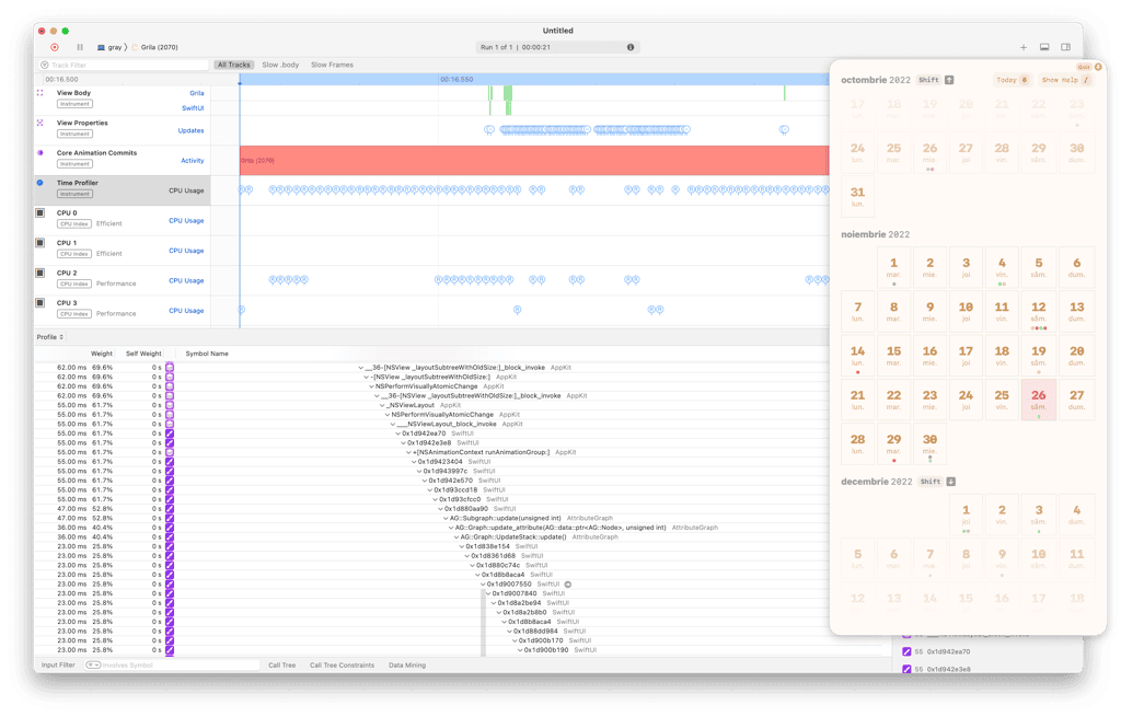
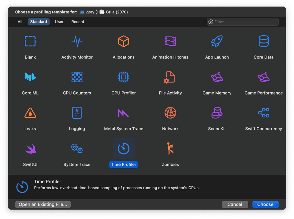
Attaching its Time Profiler to Grila showed that the heaviest stack trace was in some SwiftUI graph updating code. Look at this thing!
Click on it, I dare you.

Yes, that's how much I understood from it as well.
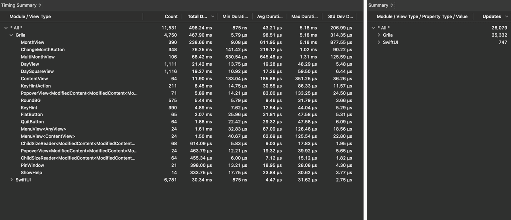
Since the stack trace is of no use, I tried the SwiftUI profiling template from Instruments.
What looks unusual is the huge number of updates on my custom views. Some updates also take 5ms or more which when called on the main thread, will block any UI rendering and animations.
Maybe I was sloppy and too liberal with my view states, I should improve on this.
# Optimisations (and wacky workarounds)
The slowest thing was the year view. Because it had to render more than 365 views, each small change was excruciatingly slow.
I lowered the number of views by consolidating each month's day views into a single, carefully aligned text string.
So this:
struct WeekRow: View {
    @State var week: Int

    var body: some View {
        ForEach(days(week)) { day in
            Text(day)
        }
    }
}

struct YearMonth: View {
    var body: some View {
        VStack {
            WeekRow(week: 1)
            WeekRow(week: 2)
            WeekRow(week: 3)
            WeekRow(week: 4)
            WeekRow(week: 5)
        }
    }
}
Became this:
struct YearMonth: View {
    var body: some View {
        Text(generateMonthText())
            .font(.body.monospaced())
            // Using the `monospaced` font makes
            // aligning text columns much easier
    }
}
Year view was now much faster, but partly neutered as I had no way of showing events or other types of information under each day. Oh well, that doesn't mean much anyway if I can't even make this app usable.
The 3-months view had no obvious low hanging fruit. The View Properties Updates profiler showed that there were a ton of updates causing the body of the view to be called many times, but it was impossible to figure out what mattered.
Somehow in my tireless internet sleuthing, I stumbled upon a SwiftUI private function that prints the changes which caused a body update: Self._printChanges()
So I could now insert that line into my DayView and work my way up to the MultiMonthView until I figured out what changes are unnecessary.
# States and Bindings
The words that you'll stumble upon the most in SwiftUI are @State and @Binding, which are property wrappers for defining local state and two-way bindings.
You see, there's this thing that happens a lot when creating SwiftUI views with deeper hierarchies:
- You create
BigContainingViewwith@State var someProp - Inside you call
SmallView(prop: someProp) - You change
somePropoutside - Why isn't
SmallViewupdating? - You add
@Binding var propintoSmallView- and call it using
SmallView(prop: $someProp)(notice the added$)
- and call it using
- Ah nice, the view is now updating
Because of this issue, I had created a shortcut for passing one-way bindings, and because of this shortcut, my list continued with:
- Performance issues..
- Why is
SmallViewNOW CONSTANTLY UPDATING?
In the following example, I needed a way to highlight the selected day, but passing selected as @State wouldn't propagate through the view graph. So I made it a binding, which caused all the DayViews to update when selecting another day (instead of just the two days that actually changed):
extension Binding {
    static func oneway(getter: @escaping () -> Value) -> Binding {
        Binding(get: getter, set: { _ in })
    }
}

struct DayView: View {
    @State var date: Date
    @Binding var selected: Bool

    ...
}

struct MonthView: View {
    @State var selectedDate: Date

    var body: some View {
        ForEach(dates) { date in
            DayView(date: date, selected: .oneway { date == selectedDate })
        }
    }
}

----------------------------------

// Logs from Self._printChanges()

DayView: _selected changed.
DayView: _selected changed.
DayView: _selected changed.
// ... repeated 77 times
The solution I found for this was to turn the Binding back into a State and manually add an .id() to the DayView that factors in the selected property.
That way, the graph algorithm will compare the new id with the old one, and if selected is different, the view will get redrawn.
struct MonthView: View {
    @State var selectedDate: Date

    var body: some View {
        ForEach(dates) { date in
            let isSelected = date == selectedDate

            DayView(date: date, selected: isSelected)
                .id("\(date)-\(isSelected)")
        }
    }
}
This change alone decreased the number of unnecessary view updates to 1/4 of what it was when I started debugging.
# ObservableObject
Another pattern I tend to overuse is having a global object with @Published properties that I can change from AppDelegate and have their changes seen by SwiftUI views.
class SomeGlobalObject: ObservableObject {
    @Published var fooDayView = true
    @Published var barHintView = false
}

let GLOBAL = SomeGlobalObject()


struct DayView: View {
    @ObservedObject var global = GLOBAL

    // ... uses fooDayView somewhere
}

struct HintView: View {
    @ObservedObject var global = GLOBAL

    // ... uses barHintView somewhere
}


// somewhere in AppDelegate

barHintView.toggle()

----------------------------------

// Logs from Self._printChanges()

DayView: _global changed.
DayView: _global changed.
DayView: _global changed.
...
HintView: _global changed.
DayView doesn't use the changed property, so all those updates could have been skipped entirely. In this case, I had to get over my tendency to not repeat myself, and just pass the properties as parameters.
There are other ways to fix this, each with its own quirks:
- Store those properties in
UserDefaults- This makes them persistent on disk which might not be desirable
- Define multiple, more specific global objects with less properties
- It becomes hard to remember which object had which property
- Pass the values as
EnvironmentValues- This needs even more boilerplate
- Helpful if the property is needed deep in the view hierarchy
Here's the EnvironmentValues alternative as an example:
struct SelectedDateKey: EnvironmentKey {
    static let defaultValue = Date()
}

extension EnvironmentValues {
    var selectedDate: Date {
        get { self[SelectedDateKey.self] }
        set { self[SelectedDateKey.self] = newValue }
    }
}

extension View {
    func selectedDate(_ selectedDate: Date) -> some View {
        environment(\.selectedDate, selectedDate)
    }
}

struct ContentView: View {
    var body: some View {
        MainView()
            .selectedDate(globalSelectedDate)
    }
}

struct SomeViewDeepDownInTheGraph: View {
    @Environment(\.selectedDate) var selectedDate

    var body: some View {
        Text(selectedDate.formatted())
    }
}
# Animations
When they’re done correctly, animations can convey information that would otherwise be missing. Like where an element was moved after a layout change, or how a view was resized when more elements appeared inside it.
SwiftUI makes this specific case easy to implement using .matchedGeometryEffect:
struct ContentView: View {
    @Namespace var namespace

    var body: some View {
        HStack {
            if showHelp {
                PinWindowButton(showHint: true)
                    .matchedGeometryEffect(id: "pinWindowButton", in: namespace)

                Spacer()
                HelpHints()
            } else {
                PinWindowButton(showHint: false)
                    .matchedGeometryEffect(id: "pinWindowButton", in: namespace)
            }
        }

        MainView()
    }
}
Animations don’t always have to be practical though. They can be added solely for their whimsical effect.
I myself love it when I’m mesmerized by an user interface that appears organic and closer to real life movement. Those interfaces feel much more personal.
Springs in SwiftUI can create that appearance without having to tune any parameter:
Button("Toggle Help Hints") {
    withAnimation(.spring()) {
        showHelp.toggle()
    }
}

// Toggling showHelp will move the PinWindowButton and change its size
//
// SwiftUI will compute the difference between the old and new layout,
// and animate that difference using the `.spring` animation
But a lot of the time, animations are overused and can’t even be turned off.
I remember the first time I used a MacBook trackpad in 2015, swiping with three fingers to move through Spaces. It felt magical.
Less than one year later, the same animation was driving me nuts because I was switching spaces so often, that the animation was slowing me down. There’s no way to disable that animation from the system, you can only reduce it to a crossfade.
Yabai can actually disable it by altering the system window manager code in memory, but that requires disabling SIP (which I can’t do anymore because I need some iOS apps on my Mac which only work with SIP enabled).
I have since settled on using a single Space with my rcmd app for instant app switching.
I wanted to improve this experience though, so I made animations completely configurable in Grila.
Because they’re computationally expensive, I disabled them by default in Low Power Mode, or when Reduce Motion is enabled in Accessibility settings.
// in AppDelegate
reduceMotionObserver = NotificationCenter.default
    .publisher(for: NSWorkspace.accessibilityDisplayOptionsDidChangeNotification)
    .sink { _ in reduceMotion = NSWorkspace.shared.accessibilityDisplayShouldReduceMotion }

lowPowerModeObserver = NotificationCenter.default
    .publisher(for: .NSProcessInfoPowerStateDidChange)
    .sink { _ in lowPowerMode = ProcessInfo.processInfo.isLowPowerModeEnabled }


// in SwiftUI
withAnimation((reduceMotion || lowPowerMode) ? .linear(duration: 0) : .spring()) {
    actionProducingLayoutChange()
}
I also gave the user the choice to enable them back, disable them completely and even change their speed and springiness.
# Is it fast yet?
Two months later, after exhausting all the optimization possibilities, the app finally felt usable. It was plenty fast for the actions that were most often used so I finally released it.
But it could be better.
I’m not entirely sure if there’s still a lot of performance left on the table for the SwiftUI engineers, but it kinda looks that way from my side. There are some places where the framework seems to be doing a lot of unnecessary work.
Taking the 3-months view for example, it renders 11 rows of days, of which only half change when going to the next month. But I’m still seeing all 11 x 7 views being scrapped and rendered from scratch.
In the AppKit world I would have had the day views as class instead of struct, and I could have updated their day number and weekday in place. It wouldn’t be easy, but it’s an optimization that would have made all the difference.
The year view is an even more dramatic example, where the 365 day views are made up of only 31 stylised text views, cloned and placed on different coordinates. Those 31 views can even be drawn beforehand and cached forever. I found no way of letting SwiftUI know about this fact, and have it used for optimization.
# Is there hope?
Obviously, I have no idea of the underlying architecture of SwiftUI, so what I'm saying might not even be possible. Or, when implemented, it would open up a can of edge cases and causing bugs that would be even worse than not having it in the first place. Or maybe my specific use case is caused by my own inability to use SwiftUI properly.
Maybe I'm just not holding it right.
But sooner or later, other app devs will try the same things I tried. The chaos of this world guarantees it.
And it's not a big deal, people could have lived without yet another calendar app. I could do other things to help my brother. The sun would still shine the next day (until it implodes 5 billion years in the future).
But ever since leaving the AppKit and UIKit world, I felt that these Apple engineers have created a magical tool. I felt like going from hammering a piece of metal to a CNC precision cutter. I'm using less force, moving much faster, and things end up even closer to how I wanted them to look.
In the last 3 years, I had the feeling that the ultimate goal for SwiftUI is to reach feature parity with the other established system UI frameworks, and we're incredibly close to that.
My hope is that after this, those Apple engineers will realise what a great thing they created, and continue honing it until we'll no longer have the need to compare the new with the old.
# EDIT: A simple way to speed this up
Two years later, I finally found the largest culprit of the slowness, and wrote about it here: How I made my SwiftUI calendar app 3x faster
