App Store doesn't accept "too simple" apps
I've had my fair share of App Store rejections in the past:
- ⌘ rcmd was rejected for usage of private APIs
- GammaDimmer was rejected for having a link to 🌕 Lunar (my app for controlling monitors that would never get accepted on the App Store)
But I wasn't prepared to be rejected because my app is "not good enough" for the App Store.
# 4.2.2 - Design - Minimum Functionality
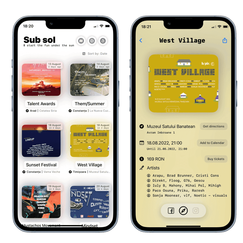
I tried to launch a simple, no-frills iOS app for party-goers and music festivals in 🇷🇴 Romania.
The backend would be a simple Google Sheet which my brother would update daily with curated underground parties and the usual festivals.
My brother is not a programmer, so entering data had to be as low tech as possible.
So ok, I did a basic SwiftUI implementation where I fetch the .csv of the sheet, massage that data into a grid of events, and add the following useful iOS features:
- Add to Calendar button (which uses
EventKitto fill in the URL, Location, End Date fields automatically, and adds the necessary reminder alerts) - Get directions button (which gives you a Google Maps link to the exact coordinates of the event. Super useful as some events are in forests or places where the address is not enough)
- Buy tickets button (which should always point you to the correct website to get tickets from)

Then I created a simple website at subsol.one and sent the app to App Store review.
After a full day of waiting, I got the most stupid rejection I ever read:
Guideline 4.2.2 - Design - Minimum Functionality
We noticed that your app only includes links, images, or content aggregated from the Internet with limited or no native iOS functionality. Although this content may be curated from the web specifically for your users, since it does not sufficiently differ from a mobile web browsing experience, it is not appropriate for the App Store.
Next Steps
We encourage you to review your app concept and work towards creating an app that offers customers an engaging and lasting experience that also meets the App Store’s high expectations for quality and functionality.
So the app does not sufficiently differ from a mobile web browsing experience. Ok. Fair enough.
# Second try
I thought the app is useful enough as it is for now.
Considering that the iOS App Store still can't get rid of so many scam apps which are even used for extortion and blackmail, I really didn't understand how this was an acceptable reason for a rejection.
The app is simple, fast, does what it says without any BS unneeded complexity. I thought subsequent features would be added based on what the users would ask for.
But sure, let's add some premature iOS native features for Apple:
- Push Notifications: so you can know instantly when new parties are found
- User Location: used for sorting by how close the events are to you, and for notifying only on events near you
- Share button: for sharing Universal Links to events with other people
Still, after even more agonising days of waiting, the same rejection came along.
# Third try
I added more iOS features, because why not:
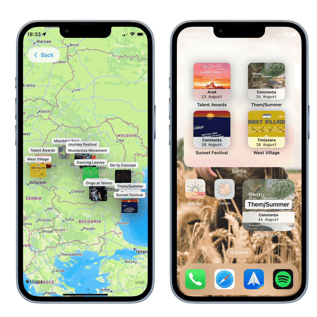
- Events on the map: to visually assess where each event is happening in the country
- This was surprisingly easy to do in SwiftUI, I was amazed myself
- Homescreen widgets: utterly useless, but can't get more iOS-y and less webapp-y than this, right?
Another day of Waiting for review and, as before, another rejection with the same generic message. This time I had to ask, what the heck did they want from me?
I sent the following message to the App Store reviewers:
What exactly do you need for this app to be accepted? I have people asking for it, it's already done and these rejections are keeping them from using the app.
It already uses the following native iOS functionalities:
- Push Notifications on new events (this is not possible on the web in iOS)
- Getting user location using CoreLocation and sorting events by how close they are
- Uses the above two functions for notifying only on new parties within 30km of the user location (again, not possible to do such a thing in a web app)
- Shows the events on the native iOS MapKit UI
- Uses a custom URL scheme (subsol:) and Universal Links for easy sharing of parties
- Has homescreen widgets for viewing the latest events
- Allows the user to add the event to calendar with most fields already filled in (event location, when it ends, useful URLs etc.)
And all I got was another generic response:
Hello,
Thank you for your response. We encourage you to consider ways to make your app stand out.
We understand that it can be difficult to determine what the best experience is to offer your users.
While there isn’t one set answer that works for every app, the following iOS development videos offer great information for helping understand how your app can provide a great user experience: – Essential Design Principles – Design Tips for Great Games
You may also want to review the Human Interface Guidelines available on Apple Developer.
Best regards,
App Store Review
# Now what?
I considered using some more device sensors to justify the app being an app.
I even did a parallax animation (because I thought it looked cool and it uses the accelerometer) and added one of those Taptic Engine button-like vibrations on clicking on the event image.
But I think they just don't like the idea of the app, and no matter what I add to it, they won't accept it.
# Update: 26 Aug 2022 at 19:30
# Uhm.. something just happened
About a week after this article started spinning around the internet, I was quietly working on a chat feature for this app when something odd happened.
I got an email from App Store Connect that the app is now In Review. Without me submitting anything more than what was already there from the third try.
10 minutes later, the app was accepted and is now there for anyone to download on the App Store.
So, not sure what happened, I can only guess that someone from the review board might have stumbled upon this article.
If that is the case, thank you kind reviewer! You made my day, and my little brother's as well.
I forgot to mention in the first part of the article that the whole idea started so that my brother can have a basic income while he's going to art college, starting this autumn. The main reason why this is an app and not a website is because in-app purchases are easier to work with than payments on the internet (no need for creating a user account, payment data is usually already available etc.).
So yeah, we're finally one step further towards that goal. Just one more thing to figure out: who would pay for such a thing?
